|
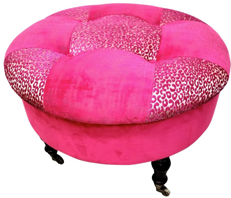
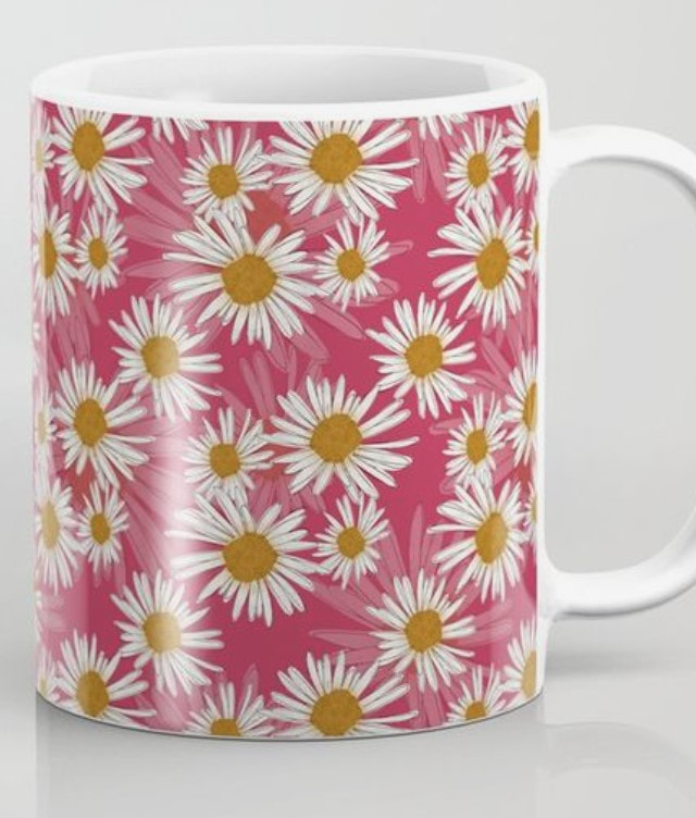
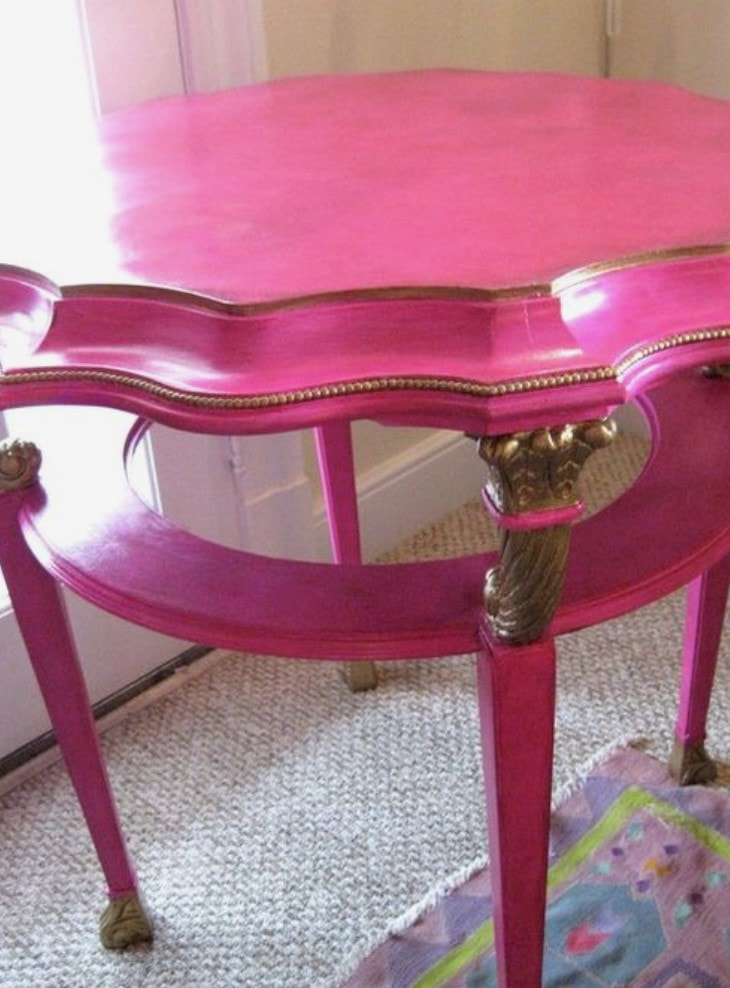
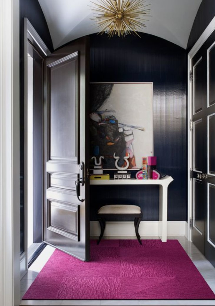
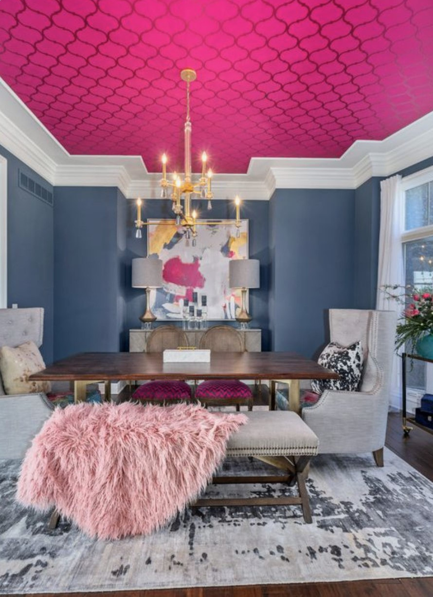
Happy Valentine's Week! I thought this would be an appropriate post this week. I’m late to the party in writing about Pantone’s 2023 Color of the Year but was prompted by an editor who was writing an article and was seeking my input for it. This was fun! Got my creative colorful right brain engaged! I focus on the fine details of kitchen and bath which is a lot of left-brain work. I even had fun creating a Pinterest board as I was thinking through all this. https://www.pinterest.com/paulakennedyckd/2023-viva-magenta/ I have been adding my version of Viva Magenta (fuchsia) to my wardrobe and even pops of color in my own apartment with dark pink hydrangea! I love pink to begin with which many of you already know, it's my happy color and the darker shade is a power color for me like red is. I've always looked good in primary colors, and I love bringing this back into my wardrobe and home. I would describe this color, Viva Magenta, as VIVACIOUS! exciting, full of energy, happy, yet the depth of the color is grounding and gender neutral. It has a bold power to it. From a color psychology perspective, we have all the benefits of red and blue in this color, blending a power color with a stable grounding color making it appeal to many. Tips for homeowners.
Remember, Pantone is not focused on home interiors. We don't always have to take the color of the year so literally. Have fun with it, make it your own, maybe more intense, or more muted, lighter or darker. You are free to interpret it in a way that works for you and your space. Work with a professional who can help you expertly implement this element in your space.
Happy Thoughts! -Paula Certified Architectural Color Consultant
3 Comments
1/6/2025 06:42:58 am
Pantone's Viva Magenta is a bold and vibrant shade that exudes energy and creativity. Its dynamic tone inspires innovation, making it a perfect choice for modern interiors. For those revamping their spaces, pairing this striking color with sleek options from a trusted Kitchen Cabinets Supplier can transform kitchens into stunning, trend-setting areas. Viva Magenta truly celebrates the power of design! 1/7/2025 02:33:35 am
Viva Magenta is such an empowering and vibrant choice for 2023! Your description truly captures its vivacious and grounding energy. Incorporating it into your wardrobe and home sounds delightful, especially with those dark pink hydrangeas. It’s inspiring to see how this bold yet balanced color enhances your creative spirit. By the way, a Hanging Wall Display Cabinet in Viva Magenta would be a stunning addition to any space, blending functionality with bold elegance! 1/20/2025 11:48:49 pm
Pantone Viva Magenta is an exciting, vibrant color that brings energy and warmth to any space. I love how it blends the boldness of red with the grounding qualities of blue, creating a powerfully balanced tone. Your ideas for incorporating it into interior design, from accent pieces to bold furniture choices, are both creative and inspiring. It's a perfect way to add personality to your home! Great post, Paula! Leave a Reply. |